

When we think of UX, what usually comes to mind is how users experience a website, a service, or an app—but with email being one of the top marketing avenues for most brands, optimizing for it is a huge must. Not only can email create a golden path to more sales for your business, but it also tends to be the primary method of communication with customers. Giving your subscribers a good UX can be the difference between them being happy to keep receiving your emails or feeling the urge to hit the unsubscribe button.
Below, we’ll go over five UX strategies you can use to tighten up your email design practices and improve your overall email marketing!
The Call-To-Action
When it comes to CTA, you typically have two choices--buttons or hyperlinks, but buttons are more likely to get you the engagement you’re looking for over hyperlinks buried within a sentence. Not only do they give you more liberty to incorporate your brand’s colors and a unique CTA, but they’re simply easier to spot.
On average, the majority of subscribers who open an email are going to be skimmers, but if they’re able to locate your CTA within seconds of laying their eyes on the email, you can still expect clicks. To boost the attractiveness of your email, use contrasting colors. For example, if the background color of your email is black, use a button with a white outline. If your design and brand identity allows it, you can even incorporate a bit of color psychology. To create a feeling of excitement or urgency, try the color red. For a more subdued feeling of trust or reliability, go with blue.
When it comes to placement, the most common and logical spot would be towards the end of a section or the email. The idea is that your reader will first be introduced to your offer through an attention-grabbing header and copy that delves more into the benefits of that offer before being directed to act, raising the chances of them actually clicking the button. However, you can also position the CTA much earlier in the email.
Let’s say your email is a short and sweet reminder for a 30% off sale your brand is having. You could have a heading broadcasting the discount and include a “Shop Now” CTA right underneath. From there, you can continue showcase your products throughout the email and finish off a CTA that’s similar or identical to the one near the top. This way, if a subscriber is already familiar with your brand, they don’t have to read through or scroll to the bottom the email to move onto the next step. You’ve made it easy for them by making the CTA one of the first aspects of the email that they see.
Mobile optimization
According to Bluecore, 53% of email users prefer to use mobile to check their email—and this number jumps to 59% for millennials and 67% for Gen Z, which means there’s really no ignoring mobile if you want to reach most of your audience. Emails optimized for desktop will still show up on mobile, but you could be setting up your subscribers for frustration if they can’t properly view your emails. For example, without proper optimization, the text in your emails may not fully fit within the mobile viewport, forcing your user to have to scroll to read. Another problem could be images that are too small, too big, or don’t wrap around the text, which can leave your email looking messy and even downright impossible to navigate.
To avoid any funky formatting, make use of a responsive email template right off the bat. Responsive design will make the mobile version of your email more compact by stacking sections on top of each other and fitting your text, images, and buttons together in a way that flows logically. When coding, you can use embedded styles in your CSS, but avoid using external style sheets as they aren’t recognized by certain major email clients. Internal and inline CSS should work just fine.
Layout
One of the most crucial aspects of good UX email design is creating an intuitive, logical layout. Your subscribers need to be able to make sense of your email in order for them to complete the goal of it. With a simple plain-text email, organizing your content with copy that reads from left to right works well enough, but if you want to include images, colors, and your brand’s own unique touch, you’ll need to strategize a little more.
Try to give your audience visual cues to help them along. A popular layout that works well for various types of emails is the S-curve. It’s a two-column design that involves placing an image on one side and text on the other, then switching the position of the image and text with each subsequent row. You may be wondering where the “s” shape comes into play exactly, but the email below should give you the idea.
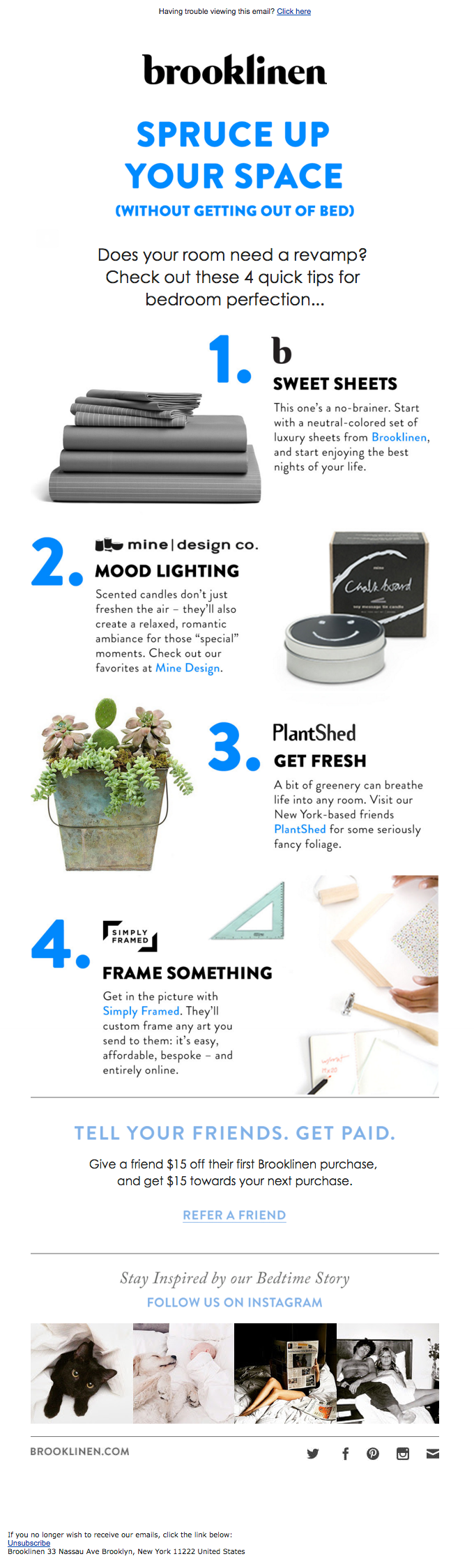
This layout works well because it employs both images and copy in a balanced way while keeping the design dynamic by alternating the positioning. Not only does this layout make for an easy-to-skim an email but it’s overall pleasing to the eye.
Keep it minimal
The minimalist design in email has been especially popular for the last few years. It’s a layout style that involves very little copy, a decent amount of white or open space, and a few images at the most. It all boils down to the cliche of “less is more”, which can be a great piece of advice to follow with email design.
An email that is crowded with too much copy, graphics, and even color can feel overwhelming to your subscribers. They won’t know where to look or what’s important, and with so many other emails to comb through, it won’t be hard for them to make the decision to keep it moving.
Even if you don’t want to go full-on minimalist, it certainly doesn’t hurt to incorporate similar attributes into your design. Easing up on the amount of copy in your email is a good place to start. Use your emails to give your readers a quick, inviting overview of your offer so that you can direct them to your site for more information, where they can actually make a purchase.
Don’t shy away from open space, either--it allows your readers the room to zero in on your message and it can even put your subscribers at ease to see a simple, straightforward design.
Dark Mode
Optimization doesn’t stop with mobile--dark mode in email is becoming more and more popular every day with 82.7% of users preferring it over light mode. Some email clients will automatically make your design dark mode-ready for their users by adjusting background or button colors, but these default styles don’t always turn out all that well. To maintain as much control as possible over your beautiful email design, you’ll want to code your own complimentary dark mode theme. Similarly to optimizing for mobile, you can use an @media query in your CSS to switch out attributes in your email for dark mode-specific ones.
Another easy method is to optimize your design for both light and dark mode, specifically when it comes to images. We suggest using a transparent background and a light outline around any logos with dark wording so that the graphic doesn’t get lost when dark mode is enabled. This way, the graphic will still present well in both modes.
Even with various hacks, email rendering can get complicated with so many email clients to appease, so make sure you do an ample amount of testing for both light and dark before sending your design out.
Conclusion
As you implement the strategies from this post and continue to refine your email marketing, remember that a brand that cares about giving its subscribers a good UX is a brand that can be trusted to deliver just as well with its products and services. At the end of the day, you’re marketing to humans and if you can consistently show that you value them, winning more sales and loyal customers won’t be a problem.
The fundamentals of good email design are easy to learn, but it can be a lot of work to get custom emails created just the way you want them. So let Scalero help! Our team of email designers have worked with a wide variety of brands and can help you build templates that are perfect for your brand’s needs. Reach out to us here today!
More from Scalero


Kristina Lauren

Kristina Lauren

Kristina Lauren
Join our mailing list
Get your fix of marketing, design and automation tips, all written by industry experts.


